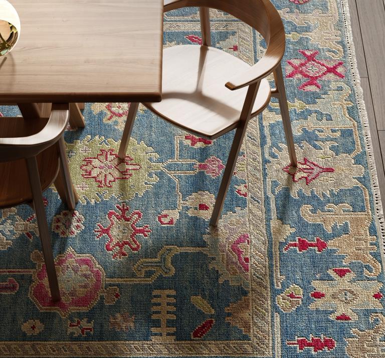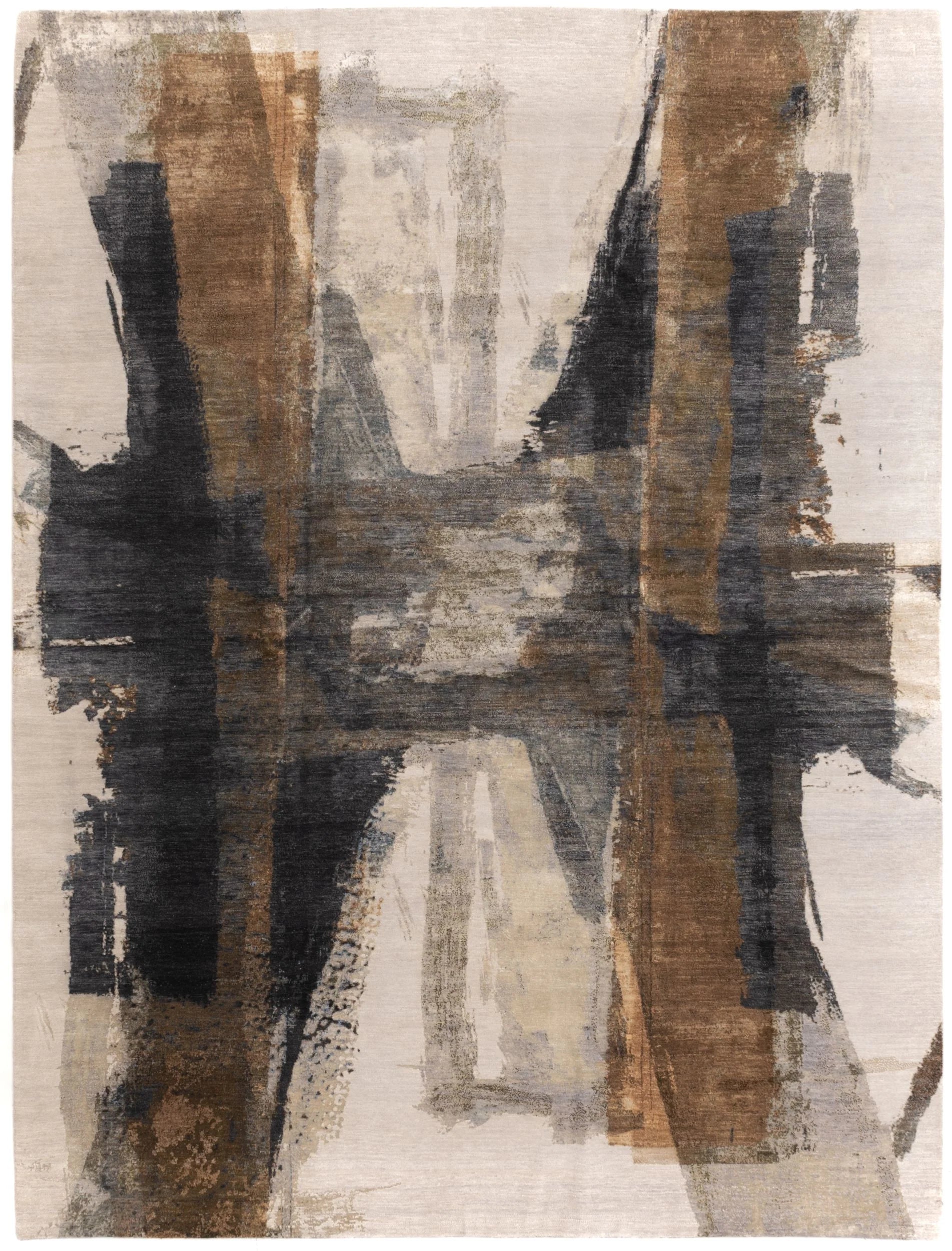

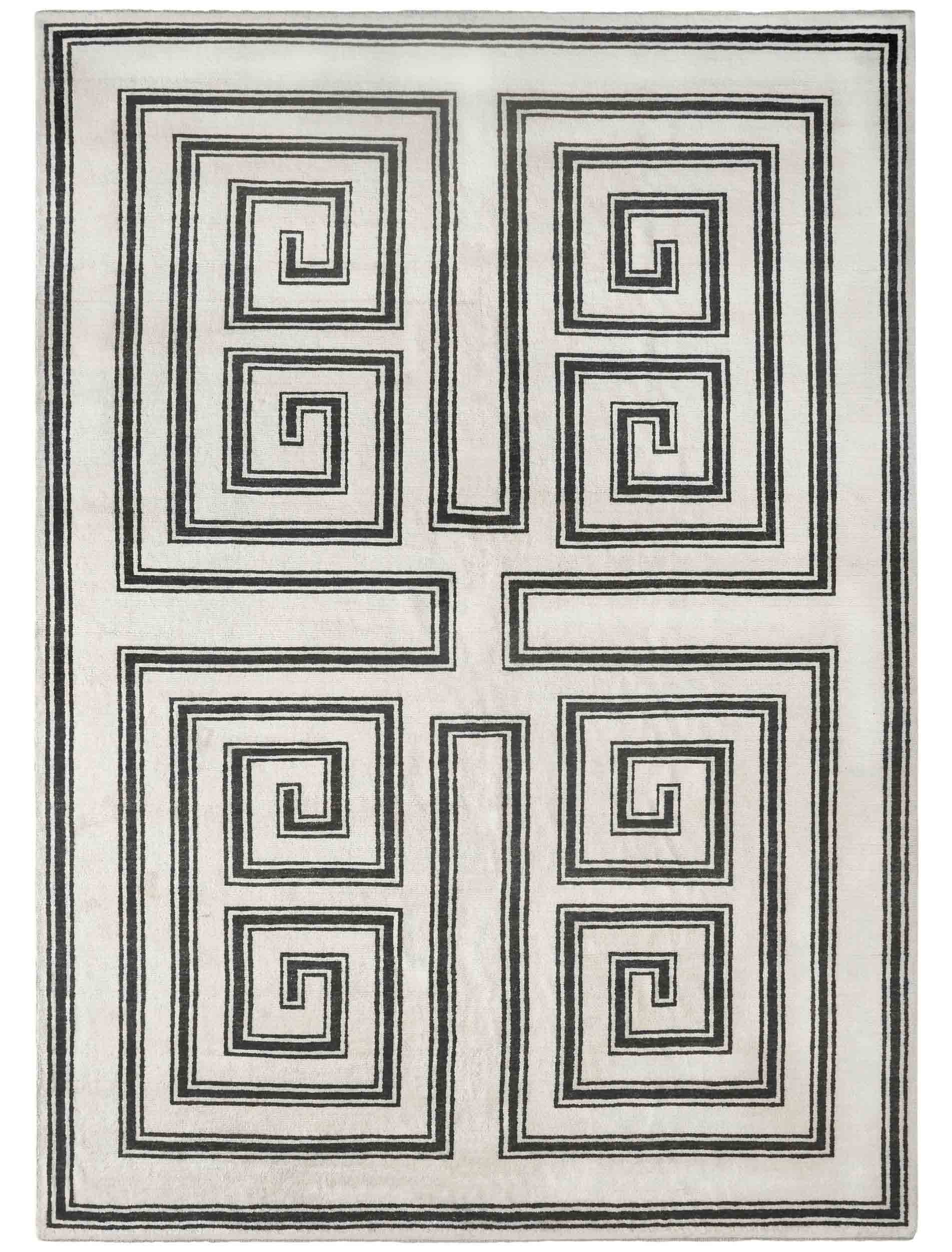
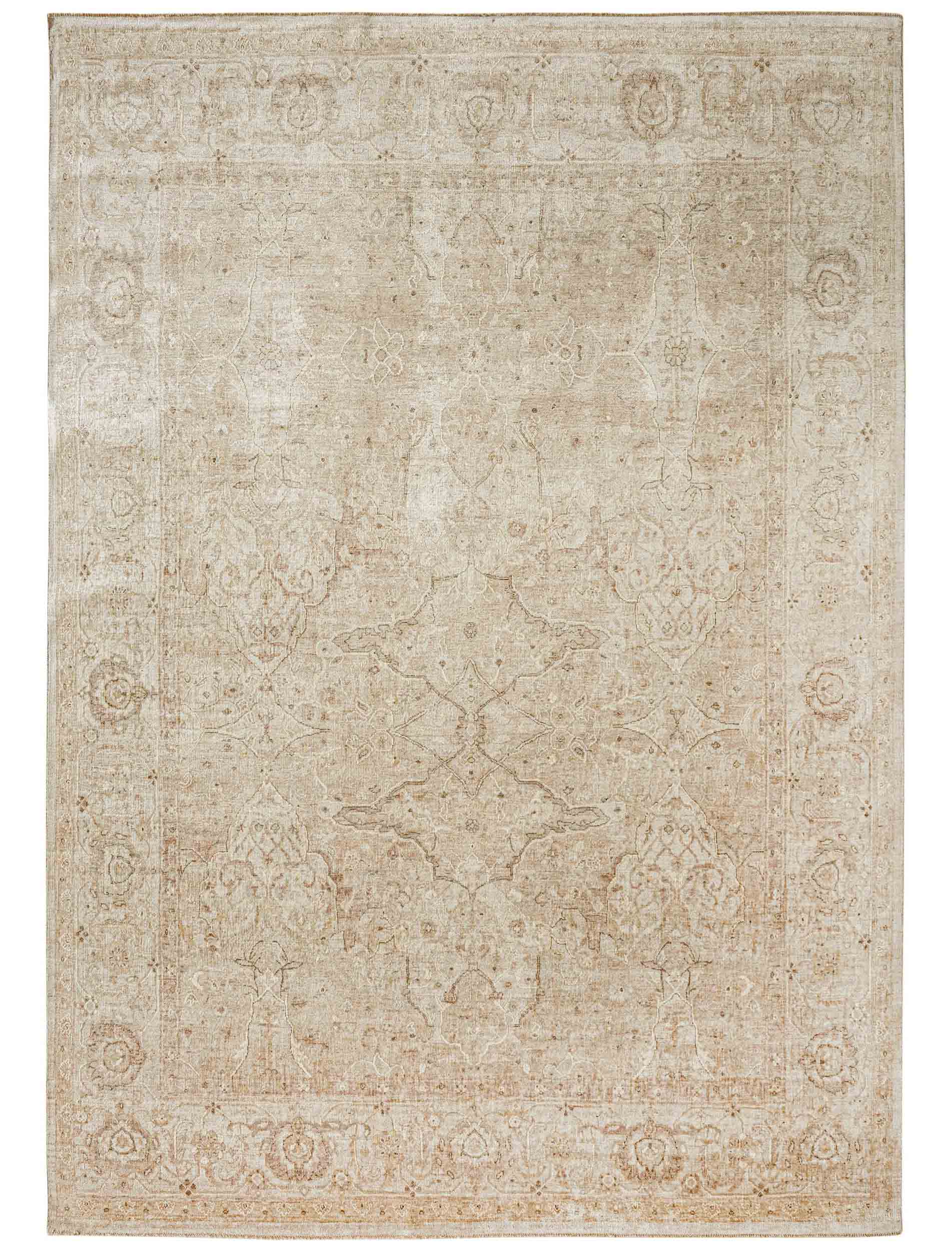


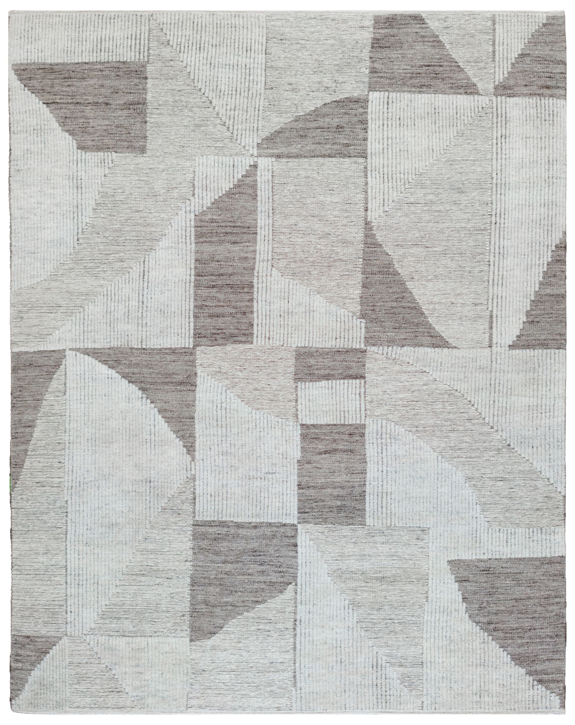
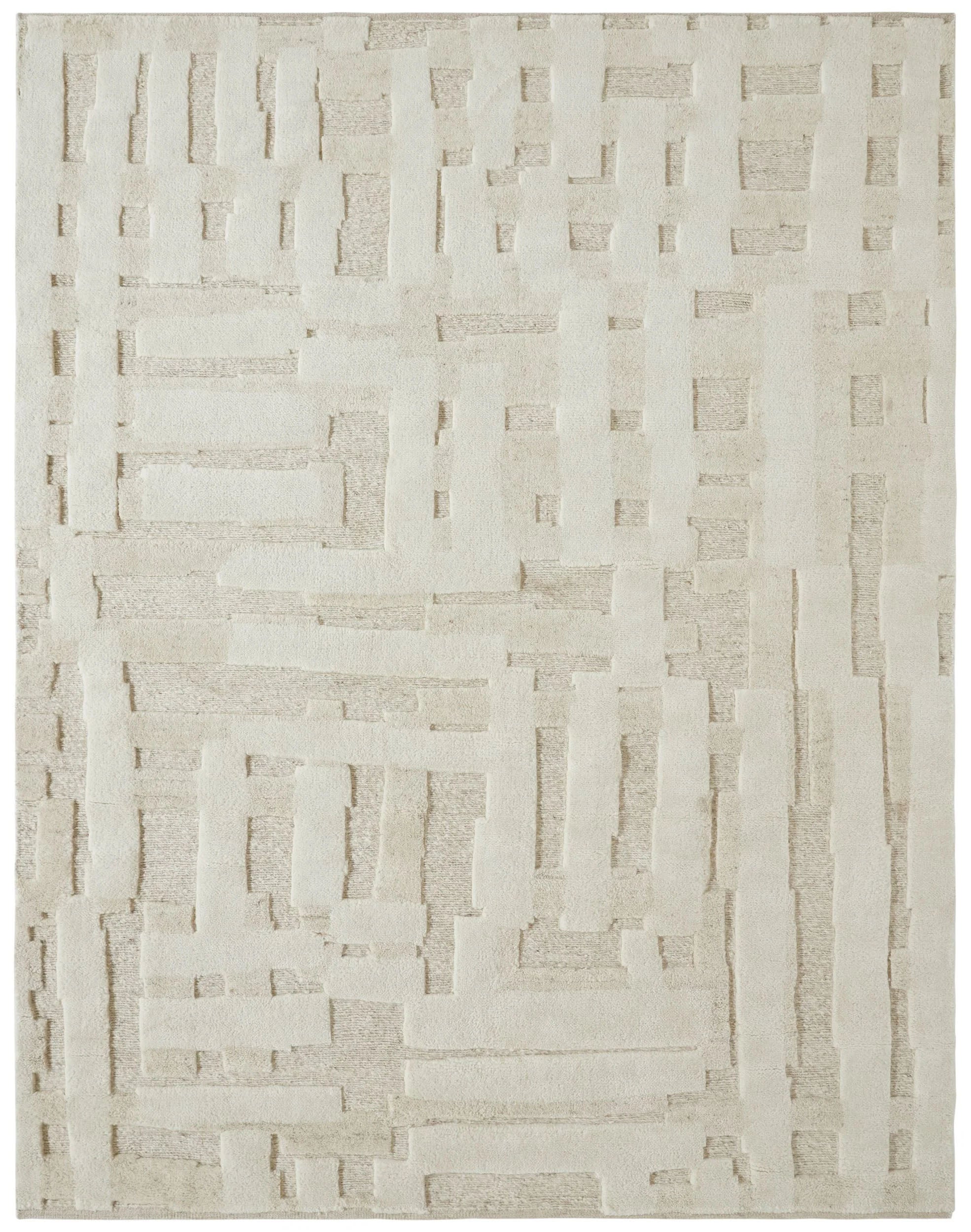
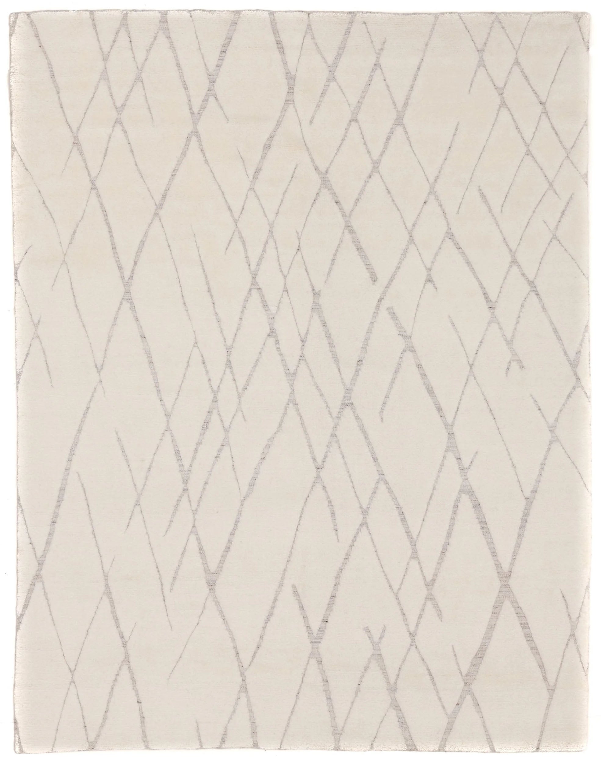
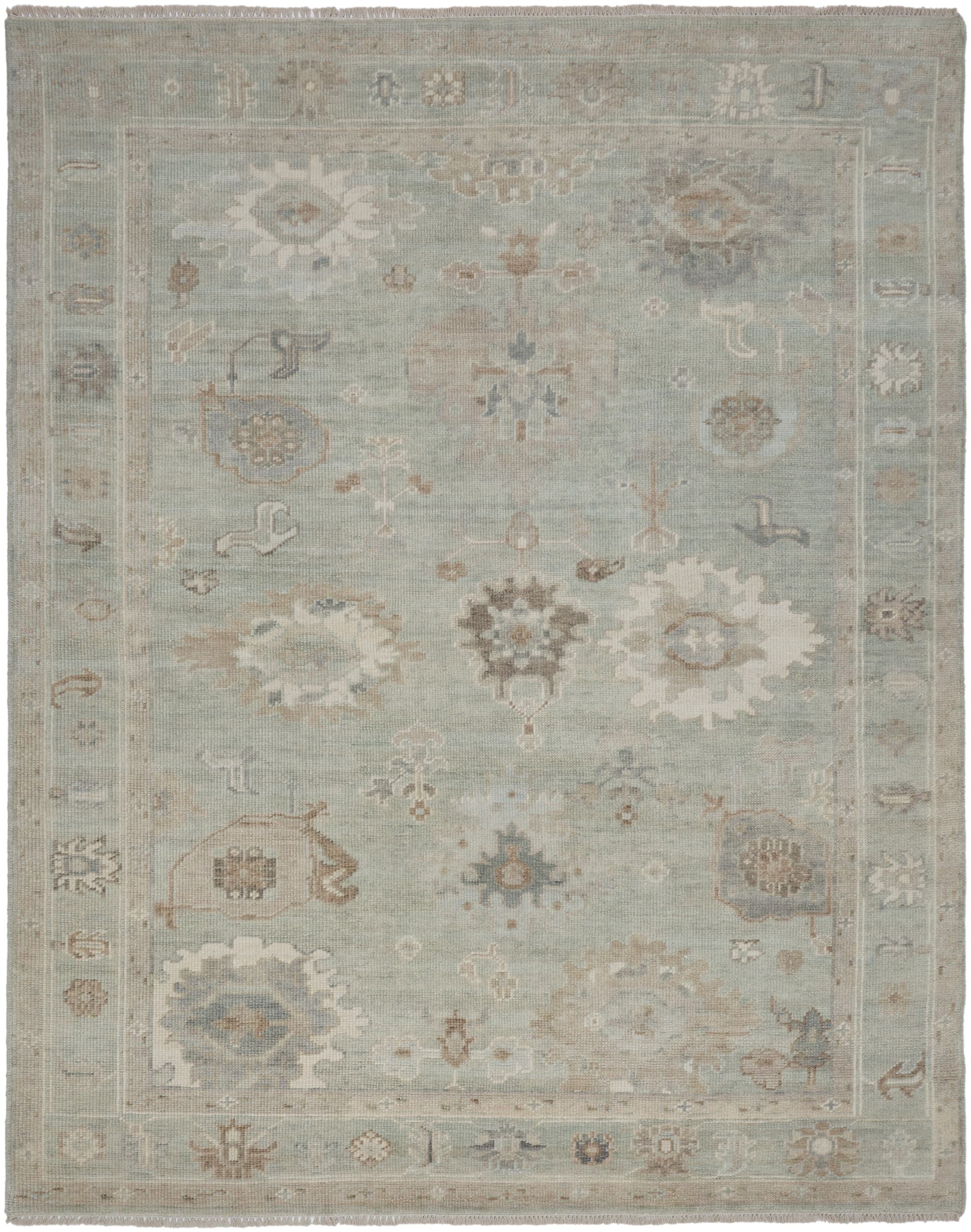

Neutrals are more than a palette—they’re a design philosophy. Thoughtfully crafted textures and subdued hues form the cornerstone of a layered and refined space. The Ashley Stark Home Rug Collection pairs tonal variations with impeccable craftsmanship - each piece is made to ground your space, creating a canvas for your home’s story.
We had the pleasure of sitting down with founder Ashley Stark to discuss her philosophy on designing with neutrals. From layering textures to creating contrast, her insights reveal the secret to mastering a monochromatic palette.
Q&A
with Ashley Stark
Q: How do you create depth and dimension using neutrals?
A: Creating depth with neutrals is all about layering. You need a mix of shades, from soft ivories to warm taupes to deeper charcoals. Think of neutrals as a gradient—you don’t want everything in the same tone.

Q: What role does texture play in making neutral spaces feel dynamic?
A: Texture is the secret weapon for making neutrals come alive. In a monochromatic palette, it’s texture that tells the story. A a woven basket, a rough-hewn wood table, or a mixed-media rug can make a neutral space feel rich and inviting.

Q: Can you share tips for mixing warm and cool neutrals?
A: Mixing warm and cool neutrals is all about balance. Start with a dominant tone—either warm or cool—and then introduce the opposite in smaller doses to create contrast. For instance, pair a warm beige sofa with cool gray rug.

Q: How do you prevent neutral spaces from feeling flat or boring?
A: Neutral spaces thrive on subtle contrast and layers. Use a mix of materials—marble, wood, metal, and natural fabrics like wool—to keep things interesting. Add architectural details like wainscoting or beams for depth. Lighting is also crucial: combine natural light with layered artificial lighting, such as sconces and table lamps, to create dimension.

Q: How do you incorporate pops of color or accent pieces into a neutral space?
A: Pops of color in a neutral space should feel intentional. I like to bring in accents through art, pillows, or even a bold vase. Nature is also a perfect way to introduce color: greenery, a bowl of citrus fruits, or flowers can add vibrancy while staying true to the natural, grounded feel of neutrals.

Q: How do you approach designing neutral spaces in different types of rooms (e.g., bedrooms vs. kitchens)?
A: The function of the room dictates the approach. For bedrooms, I lean into softness and serenity with plush textures and warmer tones—think creamy whites, soft taupes, and cozy textiles like linen and cashmere. In kitchens, I prefer a mix of cooler neutrals and durable finishes, like white marble countertops paired with gray or greige cabinetry. Kitchens can handle a little more contrast, like black hardware or a natural wood island, to keep the space dynamic yet timeless.